
In today’s fast-paced digital landscape, great User Experience (UX) is no longer a competitive advantage but a necessity—something that both businesses and users expect and demand.
This article introduces powerful strategic assets that can benefit your business, no matter the industry. Although UX is a relatively young field, best practices have already been established. Today, integrating UX into your organisation—or taking it to the next level—has shifted from being a competitive edge to a fundamental expectation from users, both online and offline.
Previously, we explored what UX entails. In this article, we’ll dive into why UX is so important for your business and provide actionable insights on how to start integrating it effectively into your company’s processes.
WhyHow UX matters
We all understand that user experience matters, and that’s probably why you found this article in the first place. Instead of reiterating the obvious reasons why UX is important, let’s dive straight into how it truly impacts an organisation—not just in terms of user satisfaction, but also financially.
First, let’s take a look at the market.
Whether we talk about web or mobile apps, the market is growing, it’s really competitive, and in many areas, I would say, saturated. The completely new ecosystem of mobile apps, formed in the past few years, is now one of the biggest industries on this planet. New mobile apps are coming out every day, probably even every hour. But people don’t suddenly use more apps.
According to TechCrunch, an average mobile user interacts with only 9 mobile apps a day, and apparently only 30 a month. So having your app installed on users’ devices suddenly becomes a noble place to be in. It’s no longer enough just to create a product that solves a problem and place it in the app store. Instead, companies have to fight for their users, often by competing for the best user experience.
To be worthwhile players, apps must be relevant to users and address and solve a real problem, a pain point, in the most smooth way possible without extra hassle. Such apps will manage to trigger even more interest and trust if the brand speaks in the tone of voice of its very users.
Nowadays, all of this is user experience design. A couple of years ago, UXD focused on how the app looks and how users get from one screen to the next. Today, it’s about taking care of the entire experience users have with that product and brand, as well as everything that has happened to them before using it in that particular context of their lives. Let me clarify – if your software solves a problem people are having, then the pain point has already been there for a while, and people have lived with it. They either solved it in a certain way familiar only to them and people alike or came up with a workaround of some sort. If your business is targeting this particular problem and you desire that people move towards your solution, then we’re talking about designing a behaviour change where users take extra steps to move from one solution to another, hopefully, a better one. How do you motivate them?

We are all humans, and our patience has its limits. According to the stats, we uninstall apps that send us annoying notifications or expect us to go through complex and troublesome sign-ups. This issue takes us back to users’ capacity and their tolerance for the extra cognitive load I mentioned earlier – if users can’t move from screen to screen intuitively without having to think much, why would they bother? They will often drop out from such a process, for example, of registration and will never create an account. By the time your designers fix the experience, those users will already be advocating for your competitor.
It’s not an understatement to say that dissatisfying user experiences cause more harm than just a momentary annoyance and affect the brand’s future. Users with bad experiences are 45% less likely to return, and many of them will maintain a negative perception of that particular brand. They will also be less likely to recommend it. A high risk of having a bad word spread produces users who are not willing to use a product without even having any direct contact with it. And tolerance for that is, on average, even lower the younger the user is.

In October 2018, McKinsey published the results of extensive research measuring how design actions unlock business value. They studied 300 companies from different sectors over 5 years. Out of thousands of design actions, they identified, that those companies were performing, and 12 of them had a heavy correlation with the company's improved financial performance. They outperformed the industry benchmark’s financial growth by 2:1…
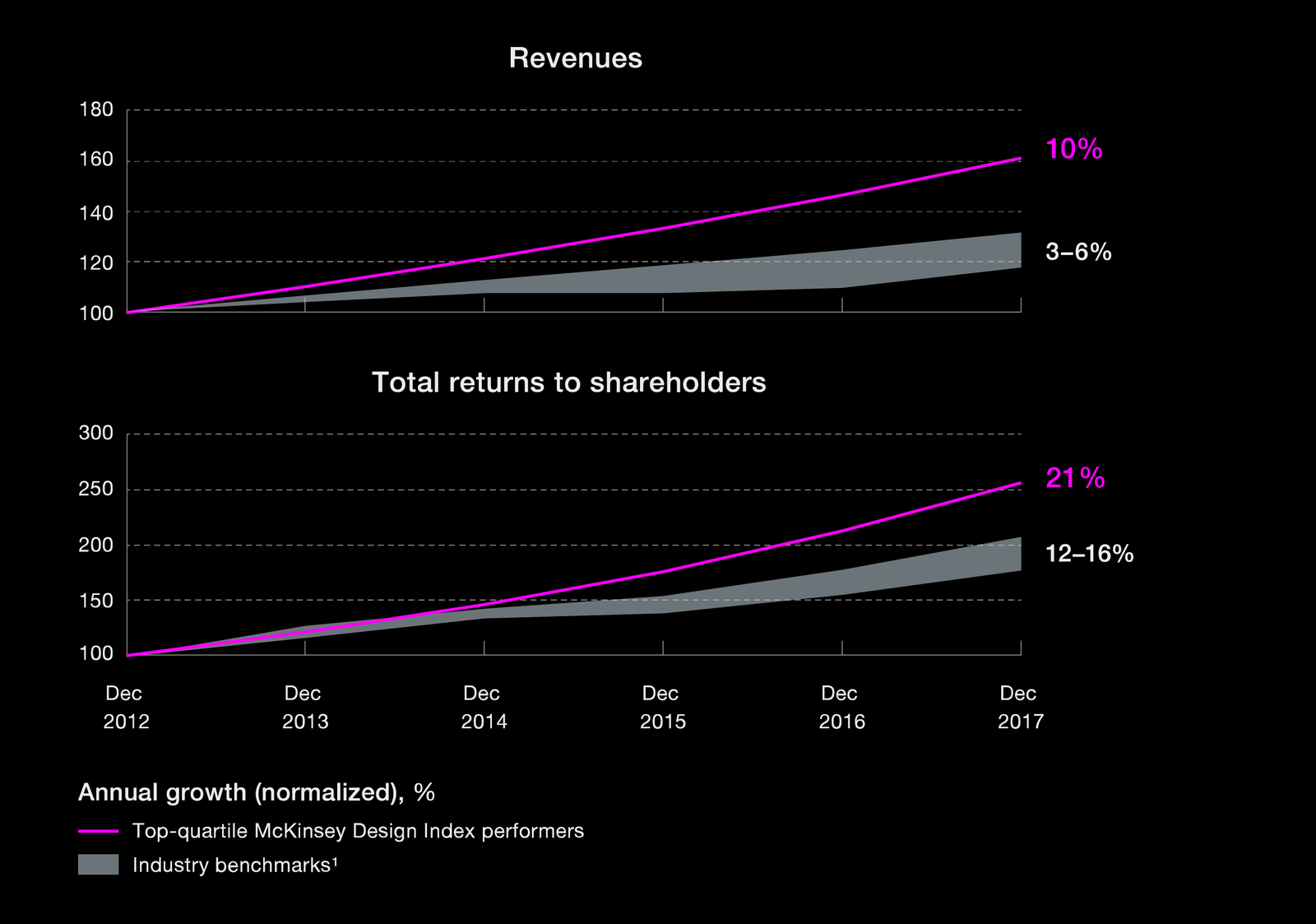
McKinsey organised those actions, significant to companies’ performance, into four categories:
User Experience – More than a product
Companies inclined to succeed have implemented user experience design fully, integrating all experiences.
This is only possible if designers truly understand the customer and the customer journey, making space for all user pain points. They could only start thinking outside of their current ecosystem and create holistic user experiences. A good example of looking wholistically and therefore removing boundaries between digital and non-digital are mobile payment services such as Google Pay and Apple Pay. They created easier ways to access cash. This could only be a result of out-of-the-box thinking and analysing the underlying needs of potential users.
Continuous Iteration – More than a phase
Design flourishes best in environments that encourage learning, testing, and user experimentation. With such an iterative approach, there are simply no irreversible design phases in product development, so users' voices don’t get lost.
In McKinsey’s research, companies that didn’t cut spending on research, prototyping, or concept generation outperformed other ones.
Cross-Functional Talent – More than a department
Another key finding is that user-centric design should be everyone’s responsibility.
Meaning, no tolerance for guarding access to ideas, no unproductive complaining about other departments, and no not admitting other colleagues’ great visions. Design touches many parts of a business, and designers can only make an impact if they have the right tools, capabilities and infrastructures. In an ideal environment, everyone advocates for UCD and further enables it.
Analytical Leadership – More than a feeling
Companies that tracked design performance as rigorously as they tracked revenues and costs, again, as expected, did better overall. I believe it’s important that senior executives embrace design metrics and do not act on a feeling telling them which design they like more. There’s also a misconception that design decisions aren’t relevant enough to be brought up to C-level. But it’s down to designers too to actively show management how their designs tie to meeting business goals.
User-Centred Design Process
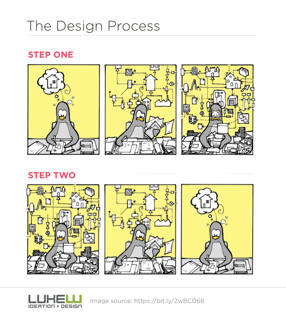
As we are done with the basics, I would like to present you with the UCD process I’ve been successfully relying on at Duesday. It took us all the way from defining first requirements to iterating design artefacts and usability testing to, luckily for us, even winning awards. However, I will broaden the scope to show you the full power of UX because no company needs all the design assets on offer. Every case is different.
Research → Insight → Concept → Design (→ Implementation & QA) → Monitoring

Research – Observe, ask, listen
Research is a common start for many projects in many industries. However, it’s worth emphasising that researching is not a phase that happens just once. It’s required for any new product, service, or feature, but also for any bigger change in that product or market behaviour.
At Duesday, I divided the research process into three categories. I separately researched the business, market and target audience, however, each category informed the other.
I started by gathering requirements in a classic form, for example, by defining success metrics together with stakeholders (or clients, if you are an agency). I also ran business and design workshops to reveal hidden knowledge.

Simultaneously, we identified who are the key players on the market – direct and indirect competitors – and who is on the rise to keep an eye on, focusing on their strengths and weaknesses and learning about their audience too. I even looked into who really inspires us and who we look up to (I find that for many companies, it’s Apple).
Lastly and most certainly not least, we researched our target audience, our future users. We reached out to publicly available research and insights, ran surveys and tests, and talked to people to learn about their problems and how they solve them but also to seek individual stories to develop a good feel for their situation (if the product already existed I would also intend to understand how it performed so far).
This phase can’t miss the tech research to understand opportunities and any potential limitations imposed by the technology.
Insight – Process, extract, prioritise
We can’t run research and collect data without generating insights on the spot. But obviously, we had to put extra effort into producing quality judgements.
We started with affinity maps and diagrams to sort the information, and used our favourite MoSCoW method to prioritise features: those that are the bare minimum (if you ask the question “What happens if this requirement is not met?” and the answer is “Cancel the project, because it doesn’t make sense otherwise.” then you know this is a must-have), those that are important and should be delivered but are not vital (it might be painful to leave them out but the solution is still viable without them), the ones that could be delivered if there is enough time / budget / resources (but are less important with less impact if left out), and finally features that only make sense if time and resources are unlimited (these are the requirements that team agrees will not be delivered but can revisit them in the next phase).
We couldn’t ignore user personas (data-based fictional characters representing user types to know and remember who we are designing for), nor user stories (a software requirement from an end-user perspective written in a particular format “As a (persona) I want (need), so that (purpose)”, for example, “As Paula, I want to organize my work, so I can feel more in control”), and so these became essential design artefacts too.
Other may include user journeys, empathy maps, storyboards…

Concept – Sketch, test, validate, iterate
At this point in our journey, I started designing our complex system in a way that allowed me to simulate the user flow for testing. We did early usability tests with users by relying on interactive wireframes built carefully with Axure (we even used global variables for users’ input so that the prototype could respond accordingly). Another method, a bit cheaper one, could be testing an idea with a paper prototype. Both result in plenty of feedback, feeding further iterations of the concept and giving it more and more refined detail.

Design – Prototype, test, package
When we proved (and improved) the concept, we could start refining the finest detail and truly simulate the final experience and product’s look and behaviour. High-fidelity prototypes find their place in this phase because their creation triggers extra questions, and sometimes extra sub-iterations of the process. The output, a finished detailed prototype, can be used for anything from detailed usability testing to investor pitches to documenting product specifications for developers – especially if they are assisted by style guides and other pieces of information required for the handover.
It’s not the first time developers have heard about the product they are about to build. They often started building it already by being involved in the process from early beginnings, improving and strengthening the final shape of the product. But this doesn’t end the designers’ job. They still have to assist developers with testing and making sure the final product meets the requirements. I assure you there will be lots of mini user-centred design processes happening here to look more into certain features, for example, on a monthly or even weekly basis.
Monitoring – Measure, analyse, plan
Once the product is ready, the real fun starts – even more detailed usability tests become an option, as well as continuous tracking of data on a huge scale. Observing how users in their real lives click and move around a product identifies future areas for improvement and design evolution. It’s important at this point to be open-minded and abandon the fear of being wrong. Designers can never know it all when making decisions. The best they can do is to make the most informed decisions, but real validation awaits outside.
I hope this article has given you a good insight into UX's relevance. I’ve touched on how we implemented it in our organisation, Duesday, and showcased some of the design artefacts we produced in an additional video format.
If you don’t have a UX designer at the moment, this is a good starting point, and I encourage you to look up many of the design artefacts I mentioned to see how they could be relevant to your business and your current challenges. And if you do have a UX designer on board, you have found out what it is that they are trying to achieve and what support they may require from you. All in all, there is no excuse not to treat your business opportunity as a design problem.
References
https://www.lukew.com
https://www.mckinsey.com
https://www.evry.com
https://www.ui-patterns.com
https://www.uxforthemasses.com
https://www.interaction-design.org
As an independent consultant and strategist, Paula seamlessly integrates client–business–technology experiences. She published her first book in 2011 and has since gained recognition as a conference speaker, addressing diverse topics such as software design, employability, stress reduction techniques, and wellness-oriented expedition planning. An accomplished yoga teacher and lifelong learner, Paula is also on a scholarly path in religious studies, specialising in Indic traditions.
- A Web Designer’s Journey to a Top-Ranked Brand with AI, UX & SEO - 23rd November 2024
- When Monks Take Up Arms: Skilful Means as a Tactical Response to Violence in Buddhist Military Engagement - 27th December 2023
- The Role of the Jain Doctrine of Nonviolence in India - 10th November 2022