Revealing the design process behind Duesday...
At Duesday we love achieving miracles. Let me share with you how we designed Duesday.
It’s an interesting read whether you are coming from a technical or design background. As a UX Design advocate, one of my purposes is to bring the design to other functions. Only this way can we bridge the gap, improve communication, share better ideas and, as a result, deliver better quality products. Sounds simple, right?
UX is everywhere, and UX Design is like filmmaking
First, let me explain a little bit more about the UX itself. I might live in a bubble because, for me, interaction and user experience happen all the time. But being surrounded by people from different fields helps me to be aware also of that bubble. So, what do I mean by it?

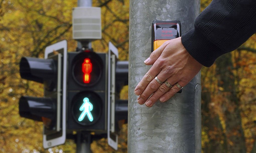
We, humans, constantly interact — with each other and ourselves, but also with the whole reality around us. Be it pedestrian crossing buttons, cars, fridges, cash machines, our mobile devices, or even food. We experience a constant ongoing interaction with various systems designed by various people and ruled by individual rules. Sometimes they are appropriate for the context, sometimes, they may have some unnecessary traces of the past.
Human-Computer Interaction is a small fraction of that interaction. Users interacting with a mobile app, website, or an entire company presence is just a small piece of the reality (I will not shrink from mentioning it’s my favourite one ?).
And, although UX is very present in the IT world these days, still it’s more of a psychological field. By definition, it includes all users’ emotions, perceptions, beliefs, preferences, responses (both physical and psychological), and attitudes about interacting with a particular system. These occur before, during and after each use. Consequently, what matters for users is the system’s efficiency, friendliness, and ease of use. This is what makes it a subjective matter because every interaction is about individual perception.
User Experience Design is trying to improve the satisfaction of that interaction by enhancing usability, accessibility, and pleasure. And therefore makes it a problem-solving field, full of researching and measuring how users respond and interact with systems.

I often like to think that UX Design is a little bit like filmmaking — something I used to do as a hobby before entering the IT world. UX Designers design experiences and their job is not supposed to be noticed, at least not consciously. They are like this camera operator and video editor whose job is to make such a good film that spectators forget it’s just a story delivered by a man walking around a room with a camera. This way, spectators can immerse themselves in the reality of the story created for them without thinking about how it was made. Unless they are movie makers too?
One of the UX gurus, Steve Krug, said many many years ago that if an interface makes users think, by taking them out of the flow of their smooth experience, then there’s something wrong with the interface (or the entire user journey), something which could be fixed. Therefore a good User Experience happens when a user goes mindlessly and intuitively through the journey, for example, through a mobile app, accomplishing all the goals they set up for themselves.
The core idea behind “Duesday: Bills reinvented”
When Marcus Kern, the CEO, and Co-Founder of CFT Group, approached me and made me aware of what he envisions for the Duesday mobile app, I was immediately hooked.
The core idea comes from the pain point of direct debits being a very old-fashioned method of paying bills. In fact, direct debits are now half a century old and didn’t evolve much over this time. We aim to change with Duesday to give people flexibility in paying their recurring bills. So, we want people to choose when they pay bills instead of having money taken from their accounts on a specific date. This is a particularly relevant feature for people who are not on a regular or high income, and who might be struggling. You probably heard that the poor pay more than the rich, or that it’s expensive to be poor. Well, if they don’t have money in their account before the direct debit takes them, they end up paying fees or have expensive overdrafts. Not to mention that often they already find finance complex and stressful.
With Duesday, we not only want to give the flexibility with paying bills a few days earlier or a few days later without any costs, but we also want to empower people and help them be on top of their finance in the most transparent way possible, giving them the control they deserve.
After this revelation, I started my research and designed the process for the whole year ahead.
 Research (1) generates insights (2) for first proofs of concepts (3) iterated until high fidelity designs, and additional requirements emerge (4) with a step back for monitoring (5), and iterating again.
The design process went underway from scratch. Although I was the very first designer who joined the company, we soon had to expand. The vision for Duesday is huge and has great potential. Now, 15 months after I joined, we are a team of three, methodically working on building a more and more recognisable Duesday brand.
Stage 1: All design phenomena should be rooted in research
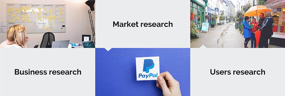
Research, for me, always is the first stage of any project, particularly in the design field. Following good practices, I usually prefer to divide it into three steps: business, market and user research.

Following good practices, we recommend dividing your research into three categories: business, market and users research
I mentioned that I joined CFT Group as the first designer. But I neglected to hint that when the new wave of employees enrolled, with me at the back, there were only five other people in the company. Together we had to set up the explicit foundations by externalising as much of the tacit knowledge as possible. To reveal this, I designed a series of business and design workshops.
Familiar with the Business Model and Lean Canvas as a former consultant, contractor and founder, I started with these. The Co-Founders, our Financial Controlled, and I have closed ourselves in the office's back room for two days of workshops to design a path that works well to accomplish our mission before running out of resources. Going through the questions of what and who we are selling and marketing to, through what channels and types of relationships and partnerships to what our key activities, costs, and revenue streams are helped me define the product to the point that I felt confident to lead the Design function. We had the magic potion of Customer-Problem-Solution, outlined metrics and surprisingly well-verbalised assumed users’ needs. A few more exercises around the brand and key features (StormDeck, Design the Box, Affinity Map, Mobilify, Six to One, and more) completed the picture to the degree that we could start getting down to requirements. I also ensured I sat down and interviewed other colleagues, developers in particular, to establish foundations for future communication and the handover process.
The next step required thorough research on our direct and indirect competitors, as well as inspirators. After assembling the list and completing the analysis, we concluded that PayPal is our biggest competitor. With one difference, PayPal specialises in one-off payments, while we are changing the recurring bills forever.
The user research stage probably took us the most significant amount of time, and in fact, it’s not the phrase that ever finishes. None of them should. Markets change, businesses develop new requirements, and with time even users respond differently to the product, not to mention taking into account its evolution.
In a nutshell, we collected insightful qualitative data through conversations with people of Liskeard, where our office is based, as well as in various networking events, asking about background, demographics, tech skills and finance. On the other hand, we reached big players for quantitative data, and their research is available online. My favourite one comes from BACS, which confirmed (and expanded) our hypothesis.

Last year BACS surveyed over 2,000 people and revealed that direct debit is mostly used for utilities, council tax, phone, tv and broadband bills, subscriptions, and similar. No surprise here, nor with the fact that payments being taken from one’s bank account on a fixed date is recognised as the main feature of direct debits.

But this lack of flexibility with paying recurring bills may result in a much more significant niche than we initially anticipated. Rigid direct debits put off a relatively large number of non- and regular direct debit users who can’t guarantee they will always have money to pay their bills at a set time.

We drew a conclusion that our case is evident, and there’s a potential demand for flexible monthly payments.
Stage 2: Surrounded by data, hungry for insights
There’s a clear overlap in every of the design stages. It’s impossible to run research and collect data without generating insights on the spot, as long as the process involves the same people. The proper production of insights, however, requires additional effort, and in another UX workshop, we defined proto-personas we could start the design process with.
Personas are fictional characters created to represent a user type that might use the product. They are helpful hats reminding everyone in the company who we are designing (building) for, as well as what’s the best strategy to respond to their needs successfully.

Stage 3: Practise safe design: use a concept
Designing a complex system with limited resources requires designing its representation first. Not only to help everyone involved further define and understand it but also to simulate the experience for its intended users. Simulations of the user journey — task-based usability tests, performed as early as possible, resulting in plenty of feedback, feeding further iterations of the concept and giving it more refined detail. That’s how a product can be tested, revisited, redesigned and improved quickly before it’s built — saving time, money, or complex tech changes.
For mobile apps, the process is straightforward — it starts with sitemaps, user journeys, wireframes, and low-fidelity prototypes. The concept stage for Duesday started with whiteboard sketches as a communication tool between designers and stakeholders. Those quickly evolved to more detailed paper prototypes simulating the most obvious user journeys: sign-up and sign-in, the bill set-up, and payment time preferences.

Paper prototypes are particularly interesting as they are very powerful (allowing simulations of both screens and their additional layers, such as dropdowns, pop-ups, and error messages) and simple at the same time — enabling designers the freedom of movement. If needed, they can be quickly digitised, all while maintaining and even enhancing their interactivity — with InvisionApp, for example.
Once we knew we were on the same page and defined the links between individual key journeys, I moved on to Axure for fully digital interactive wireframes. The target was to define and wireframe all screens and their possible key states, add buttons to link them with one another, come up with all variables we may need to simulate the experience and process the user input in a meaningful way.
Usability Testing & Market Research training day with Real Ideas Organisation
Stage 4: When the strategy gains the edge
Simultaneously we have been working on our online presence — slowly and methodically growing our social media channels and website.
We now offer a waiting list experience with an early access queue which encourages our prospective users to jump ahead and be among the first ones to have a hands-on experience with our app, or to keep on waiting and earning Duros — our in-app coins giving flexibility with shifting the payment dates. Google Analytics and Mouseflow help us keep an eye on bounce rates, at what point of the journey and why prospective users leave the website without joining the queue. Our first worry is that we promised something we didn’t deliver, so we keep revisiting our ads, newsletters, and social posts and iterating them as well. At the same time, it’s an exciting exercise to improve our tone of voice and understanding of what matters to those who visited us in the first place. Sometimes the reason is as simple as not providing enough information about our security measures.
A movement heatmap for the Home page generated by Mouseflow: Users relentlessly hovering (and later often clicking or tapping) over the static text mentioning how safe the app is, probably seeking more information
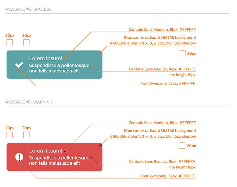
We started early with usability testing, which helped us quickly reveal significant improvements to the user journey. And as soon as we had our first User Interface Design draft ready, we started with the second round of usability tests. This got verified and improved based on users’ feedback and gave us the green light to produce a style guide, a UI pattern library for the tech team.

Our Alpha app version is now ready to be launched and released to the first 10 users from our Waiting List. A very exciting time indeed. We still have lots to learn and would greatly appreciate your feedback and insights. Perhaps we missed something on our journey — what could we have done better? Or perhaps, the Duesday app is something resonating well with your needs? Whatever the reason, let me hear from you at hi@paulakaminska.com.
As an independent consultant and strategist, Paula seamlessly integrates client–business–technology experiences. She published her first book in 2011 and has since gained recognition as a conference speaker, addressing diverse topics such as software design, employability, stress reduction techniques, and wellness-oriented expedition planning. An accomplished yoga teacher and lifelong learner, Paula is also on a scholarly path in religious studies, specialising in Indic traditions.
- A Web Designer’s Journey to a Top-Ranked Brand with AI, UX & SEO - 23rd November 2024
- When Monks Take Up Arms: Skilful Means as a Tactical Response to Violence in Buddhist Military Engagement - 27th December 2023
- The Role of the Jain Doctrine of Nonviolence in India - 10th November 2022


